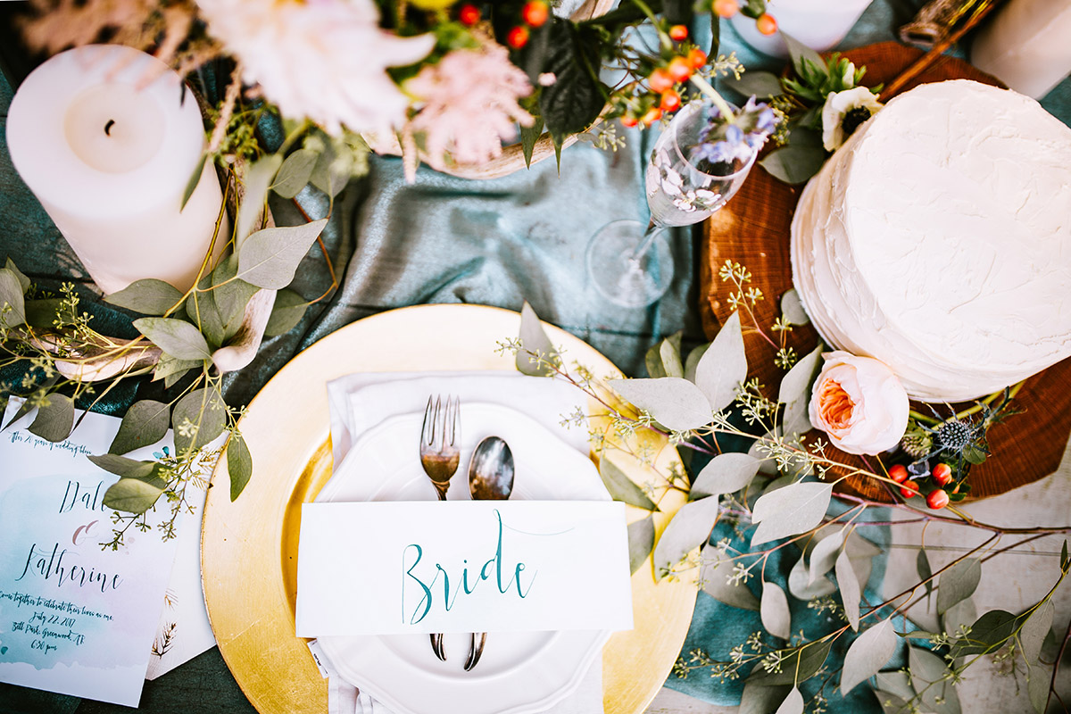
You most likely have a colour palette in mind or at least a single colour that you are strongly drawn to which will influence almost every Element of your wedding.
There are some useful guidelines you can use to find the most complimentary colours to create a palette that will suit your wedding setting and style. Consider your venue and the season you will be getting married in. Warm colours work well in Autumn and Winter whereas cool colours suit Spring and Summer weddings.
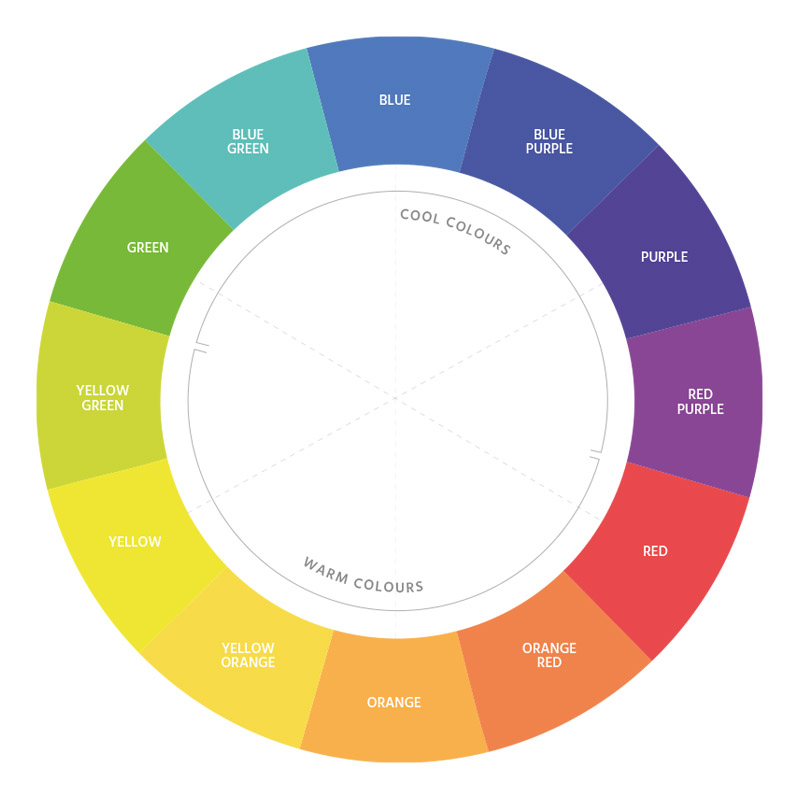
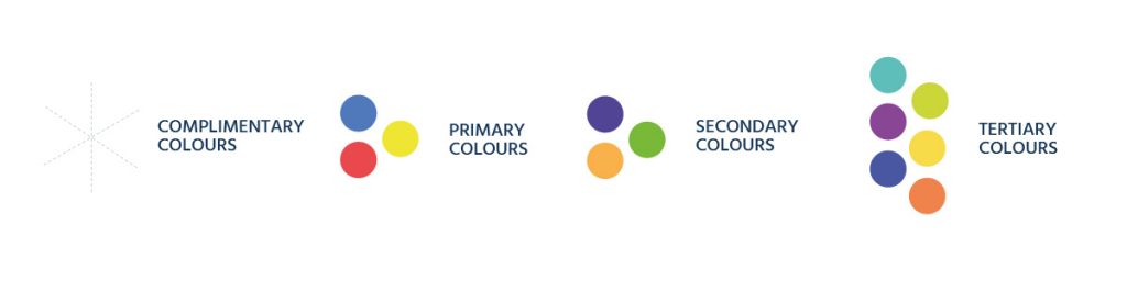
The colour wheel can guide you as you begin researching colour combinations and ideas. Select a base colour to work from and add accent colours which will create variation and depth. Pair opposite colours, one warm and one cool, to create a complimentary but contrasting palette. Alternatively, pick a bright, saturated colour and pair it with a neutral colour, like blue and grey.
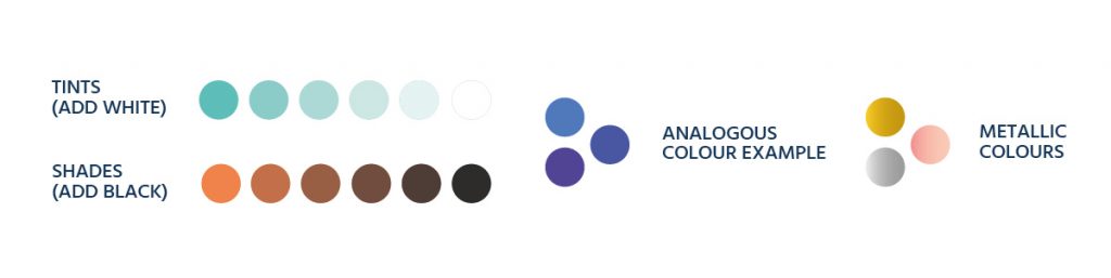
If you love a specific colour then choose an analogous palette or work with a range of tints and shades of that hue. Ultimately your colour palette should be a reflection of you and your fiancé’s style and personalities.
Colour Palette Tips
Seek Inspiration
Nature, fashion, home decor, magazines, blogs, Pinterest and other social media platforms, as well as weddings you have attended in the past can all provide inspiration for your colour palette.
Compliment Complexion
You should keep everyone’s skin tone in mind as one of the hues you choose for your colour palette will be used as the colour for your bridal party wedding attire. You and the groom may even wear accessories that feature the same colour. Tints and shades of a colour can be used to create a flattering look for a group with varying complexions.
Communicate with Suppliers
Each of your suppliers will have a different reference for a particular colour. Not everyone’s idea of blush is the same hue. Colour also differs depending on application. Bright blue on screen compared to the same colour printed on paper can look very different. Once you have selected your colours, choose Pantone versions and provide them to your suppliers so they can match colours to be used for the various elements of your wedding.
Three to Five Hues
In general, three to five colours will provide you with all the creative flexibility whilst ensuring consistency across different elements. There is no need to match every detail or incorporate the base colour in every single element. This may in fact detract from your overall wedding vision and look one dimensional.


